Color Psychology: Choosing the Right Paint Colors for Your Home
Understanding the principles of color psychology allows homeowners to strategically select paint colors that profoundly influence mood, perception, and overall well-being within each room, transforming a house into a truly personalized sanctuary.
Have you ever walked into a room and immediately felt a certain way? Perhaps a vibrant yellow kitchen made you feel energetic, or a serene blue bedroom brought a sense of calm. This isn’t just coincidence; it’s the powerful influence of color psychology home design at play. The colors we choose for our living spaces can profoundly impact our mood, productivity, and overall comfort, making the selection of paint colors a crucial aspect of creating a truly harmonious home.
Understanding the Basics of Color Psychology
Color psychology is the study of how colors affect human behavior, mood, and emotions. In the context of home design, it’s about harnessing these effects to create specific atmospheres in different rooms. Each color carries its own unique set of associations and can evoke distinct feelings, whether consciously or subconsciously.
The impact of color extends beyond mere aesthetics; it influences everything from our appetite to our sleep patterns. Understanding these fundamental principles allows us to make informed decisions that go beyond personal preference, creating environments that truly serve our well-being.
The Emotional Spectrum of Colors
Different colors are often categorized by the emotions they tend to evoke. Warm colors, such as reds, yellows, and oranges, are known for their stimulating and energetic qualities. They can make a space feel more intimate and inviting, often associated with passion, joy, and creativity. Conversely, cool colors like blues, greens, and purples typically promote feelings of calm, serenity, and relaxation. These hues can make a room feel more expansive and peaceful.
- Warm Colors: Stimulating, energetic, inviting, can make spaces feel smaller and cozier.
- Cool Colors: Calming, serene, relaxing, often make spaces feel larger and more open.
- Neutral Colors: Versatile, balancing, create a stable and sophisticated backdrop.
- Earth Tones: Grounding, natural, provide a sense of comfort and connection to nature.
Beyond these broad categories, individual shades and tints also play a significant role. A bright, bold red will have a very different effect than a muted, earthy terracotta. The intensity and saturation of a color can amplify or soften its psychological impact, allowing for nuanced design choices that cater to specific needs and desires within each room.
The science behind color psychology suggests that our responses are often rooted in evolutionary and cultural associations. For example, blue is often linked to the sky and water, symbols of tranquility, while red is associated with fire and blood, evoking urgency or passion. Recognizing these deep-seated connections is the first step toward effectively utilizing color in your home.
Choosing Colors for Living Rooms and Social Spaces
Living rooms and other social areas are often the heart of the home, places where families gather, and guests are entertained. The color choices here should foster connection, comfort, and an inviting atmosphere. Balance is key, as these rooms need to be both stimulating enough for conversation and relaxing enough for unwinding.
Consider the primary function of your living space. Is it a lively hub for frequent gatherings, or a quiet retreat for evening relaxation? Your answer will guide your color palette, allowing you to select shades that resonate with your lifestyle and the desired mood.
Creating Inviting and Engaging Environments
For living rooms, warm neutrals like beige, cream, or light gray provide a versatile and sophisticated backdrop. These colors allow furniture and decorative items to stand out, offering flexibility for seasonal changes in decor. They also promote a sense of calm while still feeling welcoming.
- Soft Neutrals: Beige, cream, light gray create a calm and flexible foundation.
- Warm Accents: Introduce warmth with terracotta, soft orange, or muted yellow in decor.
- Blues and Greens: Can be used in lighter shades to add a touch of serenity without overwhelming.
- Earthy Tones: Olive green or warm browns can ground the space and add a natural feel.
If you prefer a more vibrant and energetic space, consider incorporating bolder colors as accent walls or through accessories. A deep blue can add sophistication, while a muted green can bring the outdoors in, promoting a sense of renewal. The goal is to create a dynamic yet comfortable environment that encourages interaction and relaxation.
The type of light a room receives also influences how colors appear. Rooms with abundant natural light can handle deeper, richer hues, while those with less light might benefit from lighter shades to maximize brightness. Test paint samples on your walls and observe them throughout the day to see how they interact with varying light conditions before committing to a choice.
Selecting Hues for Kitchens and Dining Areas
Kitchens and dining rooms are zones of nourishment, activity, and often, lively conversation. The colors chosen for these areas can significantly influence appetite, energy levels, and the overall dining experience. Bright, stimulating colors are often favored here, but moderation is important to avoid overstimulation.
Think about the rhythm of your kitchen and dining area. Is it a bustling family hub or a refined space for entertaining? The functionality and desired ambiance will help you narrow down the perfect color scheme, ensuring these spaces are both practical and aesthetically pleasing.
Energizing and Appetite-Stimulating Palettes
Yellows and oranges are popular choices for kitchens and dining areas due to their association with happiness, warmth, and energy. Yellow can stimulate appetite and conversation, making it ideal for breakfast nooks or family dining. Orange, in its softer tones, can also encourage social interaction and create a cheerful atmosphere.
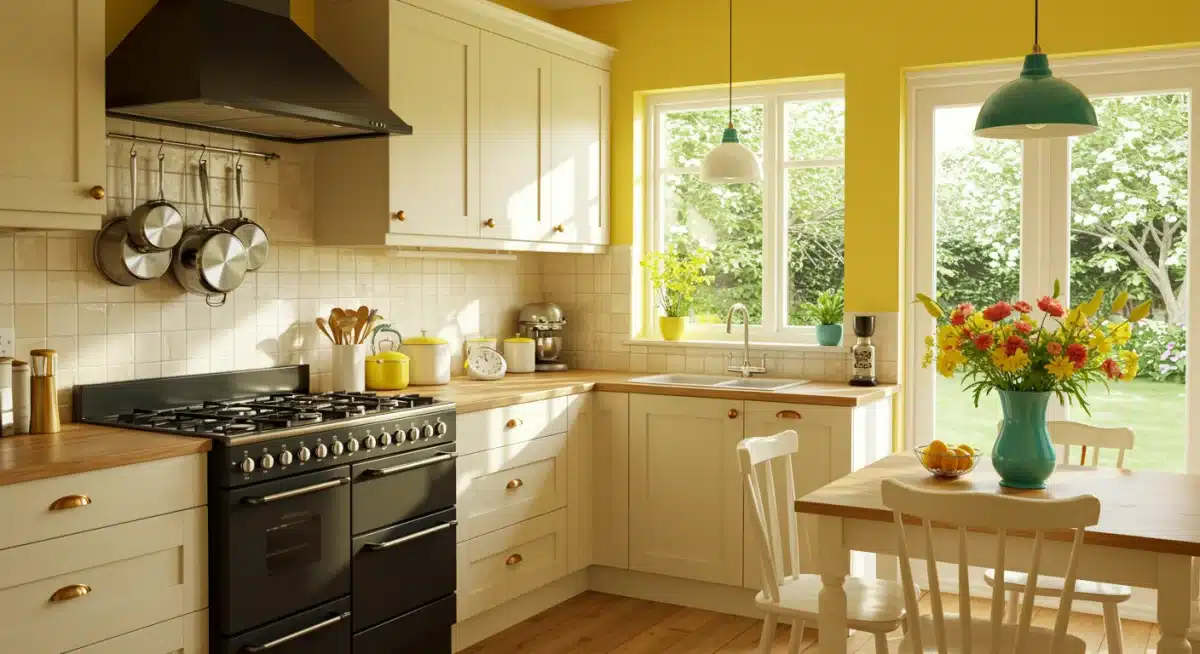
- Yellow: Promotes cheerfulness, energy, and can stimulate appetite.
- Orange: Encourages social interaction and warmth, ideal for dining.
- Red: Use sparingly as an accent; can increase heart rate but also stimulate appetite.
- Greens: Fresh, natural greens can bring a sense of health and vitality to a kitchen.
For those who prefer a more tranquil kitchen, light greens or blues can offer a refreshing alternative, evoking cleanliness and calm. However, be mindful that too much cool color might suppress appetite for some individuals. A balanced approach often involves using a cool base color with warm accents through decor or cabinetry.
In dining rooms, deeper, richer shades can create a sense of sophistication and intimacy. Deep reds or burgundies can evoke luxury and warmth, perfect for formal dinners, but should be used thoughtfully to avoid making the room feel too small or intense. Navy blue or emerald green can also provide an elegant backdrop, especially when paired with metallic accents.
The materials in your kitchen and dining areas, such as cabinetry, countertops, and flooring, also play a vital role in the overall color scheme. Ensure your chosen paint colors complement these fixed elements, creating a cohesive and visually appealing space that feels both inviting and functional.
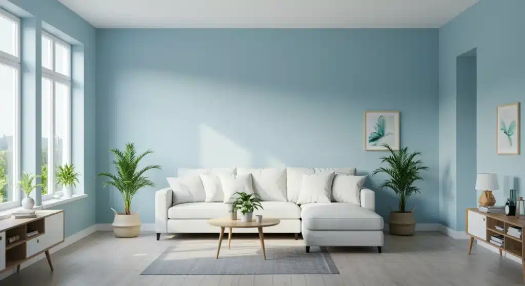
Designing Bedrooms for Rest and Relaxation
Bedrooms are personal sanctuaries, dedicated to rest, relaxation, and rejuvenation. The colors chosen for these private spaces should promote tranquility, reduce stress, and support a peaceful night’s sleep. Soft, muted tones are generally preferred, creating an environment conducive to unwinding.
Consider your personal preferences for relaxation. Do you find comfort in cool, airy spaces or warm, enveloping hues? Your answer will significantly influence the most effective color palette for your bedroom, ensuring it truly becomes a haven tailored to your needs.
Calming Palettes for Serene Sleep
Blues are a classic choice for bedrooms due to their strong association with calm, peace, and serenity. Light to medium blues can mimic the sky or ocean, fostering a sense of openness and tranquility. Greens, particularly soft sage or muted olive, also promote relaxation and a connection to nature, creating a soothing atmosphere.
- Blues: Promote calm, peace, and aid in relaxation and sleep.
- Greens: Soothing, natural, reduce stress, and foster a sense of well-being.
- Lavender/Soft Purples: Can be very calming and promote creativity, but avoid overly vibrant purples.
- Warm Neutrals: Beige, cream, and soft grays offer a gentle, understated backdrop for rest.
Beyond blues and greens, soft purples like lavender can also be effective, as they are often associated with spirituality and peace. However, it’s best to stick to lighter, muted shades to avoid creating a stimulating environment. Warm neutrals such as beige, cream, or light gray can also create a very restful space, especially when paired with natural textures and soft lighting.
Avoid overly bright or highly saturated colors in the bedroom, as these can be too stimulating and interfere with sleep. Reds, oranges, and vibrant yellows, while great for social spaces, are generally not recommended for primary bedroom walls. If you love these colors, consider using them in small doses as accents in bedding or artwork, rather than on large wall surfaces.
The lighting in your bedroom, both natural and artificial, is also crucial. Warm, dimmable lighting can enhance the feeling of coziness and relaxation, complementing your chosen paint colors. Ensure your bedroom feels like a true escape, a place where you can fully decompress and recharge after a long day.
Bathroom and Home Office Color Considerations
Bathrooms and home offices serve distinct purposes, each requiring a thoughtful approach to color selection. Bathrooms are often spaces for rejuvenation and cleanliness, while home offices demand focus, productivity, and sometimes, creativity. The right colors can significantly enhance the functionality and mood of these specialized areas.
When approaching these rooms, consider the primary activities that take place within them. Are you seeking an invigorating start to your day in the bathroom, or a distraction-free zone for concentrated work in your office? Tailoring your color choices to these specific functions is paramount.
Colors for Focus, Freshness, and Productivity
For bathrooms, light and airy colors are often preferred, as they evoke cleanliness and freshness. Whites, light blues, and soft greens are excellent choices. White creates a crisp, clean feel, while light blues can be calming and refreshing. Soft greens can bring a spa-like tranquility, turning your bathroom into a personal oasis.
- Bathrooms: Whites, light blues, soft greens for cleanliness, freshness, and a spa-like feel.
- Home Offices: Blues for focus, greens for balance, grays for sophistication, or even vibrant accents for creativity.
- Avoid in Bathrooms: Overly dark or warm colors that can make the space feel small or less clean.
- Avoid in Home Offices: Colors that are too distracting or overly stimulating if focus is paramount.
In home offices, the goal is to create an environment that supports concentration and productivity. Blues are often recommended for their ability to promote focus and logical thought. Greens can also be beneficial, as they are associated with balance and harmony, reducing eye strain during long hours of work. Neutral grays or off-whites can provide a sophisticated and distraction-free backdrop, allowing you to personalize with colorful accessories.
If your work requires creativity, consider incorporating a subtle accent of a more stimulating color, such as a soft yellow or orange, on one wall or through decorative elements. However, for tasks requiring intense focus, it’s generally best to stick to cooler or neutral palettes. The key is to find a balance that supports your specific work needs without causing undue mental fatigue.
Ventilation and lighting are also important factors. In bathrooms, ensuring good lighting can make light colors appear even brighter and cleaner. In home offices, natural light is ideal, but if not available, choose colors that work well with artificial light to prevent eye strain and maintain a productive atmosphere throughout the day.
The Role of Neutrals and Accent Colors
While bold colors often capture attention, the power of neutrals and strategically placed accent colors cannot be overstated in creating a cohesive and dynamic home. Neutrals provide a foundational canvas, offering versatility and timeless appeal, while accents inject personality, depth, and visual interest.
Understanding how to effectively combine these elements is crucial for achieving a balanced and sophisticated interior design. Neutrals prevent sensory overload, allowing the eye to rest, while accents draw attention to specific features or add pops of energy.
Balancing Your Palette for Cohesion and Style
Neutrals like white, beige, gray, and greige (a blend of gray and beige) are incredibly versatile. They create a sense of calm and spaciousness, making rooms feel larger and brighter. They also provide an ideal backdrop for showcasing artwork, furniture, and decorative accessories, allowing these elements to truly shine without competing with overpowering wall colors.
- Foundation: Neutrals provide a timeless and flexible base for any design style.
- Versatility: Easy to update decor without repainting entire rooms.
- Accents: Introduce bolder colors through cushions, throws, artwork, or a single accent wall.
- Balance: Use the 60-30-10 rule (60% dominant color, 30% secondary color, 10% accent color) for harmony.
Accent colors are your opportunity to infuse personality and energy into a space. These can be vibrant hues or deeper, richer tones that complement your neutral base. An accent wall, painted in a striking color, can define a zone within an open-plan space or highlight an architectural feature. Smaller accents, like throw pillows, vases, or books, can tie a room together and add visual intrigue without a major commitment.
When selecting accent colors, consider the overall mood you want to achieve and how they interact with your dominant neutral. A pop of warm yellow can enliven a gray room, while a deep teal can add sophistication to a beige palette. The key is to use accents thoughtfully, allowing them to enhance rather than overwhelm the space.
Experiment with different combinations. Gather paint swatches, fabric samples, and decor items to see how they look together in various lighting conditions. This careful consideration ensures that your chosen palette, both neutral and accent, creates a harmonious and inviting home environment that reflects your personal style and supports your well-being.
Practical Tips for Choosing and Applying Paint
Choosing the right paint color is only half the battle; successfully applying it and ensuring it looks good in your home requires practical considerations. From sampling colors to understanding finishes, a few key steps can make all the difference in achieving a professional and satisfying result.
Don’t rush the process. Taking the time to properly prepare and execute your painting project will save you headaches and ensure you’re delighted with the final outcome. A little planning goes a long way in transforming your space.
From Swatch to Wall: Making Informed Decisions
Never choose a paint color based solely on a small swatch. Colors can look drastically different on a large wall surface compared to a tiny sample, especially under varying light conditions. Always purchase sample pots and paint large swatches (at least 2×2 feet) directly onto your walls in several areas of the room.
- Test Samples: Paint large swatches on walls and observe them throughout the day and evening.
- Consider Lighting: Natural light, artificial light, and even bulb temperature affect color perception.
- Paint Finish: Flat, eggshell, satin, semi-gloss, and high-gloss finishes each have unique properties.
- Preparation is Key: Clean, patch, and prime walls for the best adhesion and a smooth finish.
Observe these painted swatches throughout the day and night to see how the color changes with natural and artificial light. Pay attention to how it interacts with your furniture, flooring, and existing decor. What looks perfect in the morning sun might appear too dark or too bright under evening lamps.
The paint finish also significantly impacts how a color appears and performs. Matte or flat finishes hide imperfections well and offer a soft, sophisticated look, but are less durable and harder to clean. Eggshell and satin finishes are more durable and washable, making them popular for living areas and bedrooms. Semi-gloss and high-gloss finishes are highly durable and reflective, ideal for trim, doors, and high-traffic areas like kitchens and bathrooms, as they are very easy to clean.
Finally, proper preparation is paramount for a professional finish. This includes cleaning your walls, patching any holes or cracks, and priming, especially if you’re painting over a dark color or a new surface. Investing time in preparation will ensure your chosen colors look their best and last for years to come.
| Room Type | Recommended Color Psychology |
|---|---|
| Living Rooms | Warm neutrals and balanced accents for comfort and social interaction. |
| Kitchens/Dining | Energizing yellows/oranges, or fresh greens for appetite and activity. |
| Bedrooms | Calming blues, greens, or soft neutrals for rest and relaxation. |
| Home Offices | Blues for focus, greens for balance, or sophisticated grays for productivity. |
Frequently Asked Questions About Home Color Psychology
Colors profoundly influence our emotional state. Warm colors like red and yellow can evoke energy and excitement, while cool colors such as blue and green tend to promote calmness and relaxation. Your home’s palette can consciously or subconsciously shape your daily feelings and interactions.
While general guidelines exist (e.g., blues for bedrooms), there are no rigid universal rules. Personal preference, local climate, available light, and cultural context all play significant roles. It’s crucial to consider the intended function and desired atmosphere of each specific room in your home.
Yes, absolutely. Lighter, cooler colors (like pale blues or greens) tend to make a room feel more expansive and open by receding visually. Conversely, darker, warmer colors (such as deep reds or browns) can make a room feel cozier and more intimate, sometimes making it appear smaller.
Natural light is extremely important. A color can look entirely different under bright morning sun compared to soft afternoon light or artificial evening light. Always test paint samples on your walls and observe them at various times of day to ensure the color performs as desired.
The best approach often involves a balance. Neutrals provide a versatile and calming foundation, while bold colors can be used as accents to add personality, energy, and visual interest. Consider using bold hues on an accent wall or through decor to avoid overwhelming a space.
Conclusion
The journey of selecting paint colors for your home is more than just a decorative decision; it’s an exploration into the profound impact of color psychology on your daily life. By thoughtfully choosing hues that align with the intended function and desired mood of each room, you can transform your living spaces into environments that truly nurture your well-being, productivity, and overall comfort. From the serene blues of a bedroom to the energetic yellows of a kitchen, every color choice contributes to the unique narrative and emotional landscape of your home, making it a personalized sanctuary that reflects and supports your lifestyle.


